Silverlion
Legendary Pubber
- Joined
- Aug 28, 2017
- Messages
- 4,540
- Reaction score
- 8,672
I can't share one picture, but most of the 2E black cover books fit this--most not all. I can't stand to go from Elmore to that hideousness.
Follow along with the video below to see how to install our site as a web app on your home screen.

Note: This feature currently requires accessing the site using the built-in Safari browser.

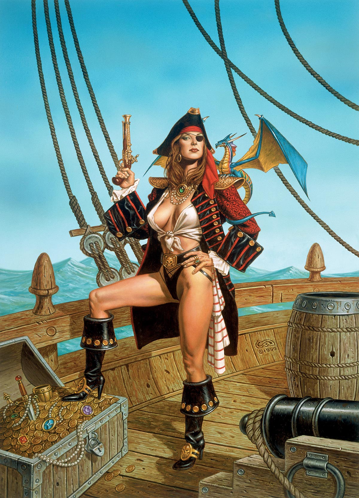
These two images sold a lot of d&dReally? Nobody?
I am not going to pretend that 8-12 year old me didn't like D&D cheesecake. Before I started dating at age 12 I would watch an entire film for a 2-second flash of tits. This was 1982-1986 and long before one could type "boobs" in a web browser. A lot of it hasn't aged well but then again, I could say the same for a great deal of pre-Internet... everything.Really? Nobody?
Really? Nobody?
I assure you it's in my 2nd printing copy of the PHB, opposite page 163 (Chapter 6: Customization Options).
I am not going to pretend that 8-12 year old me didn't like D&D cheesecake. Before I started dating at age 12 I would watch an entire film for a 2-second flash of tits. This was 1982-1986 and long before one could type "boobs" in a web browser. A lot of it hasn't aged well but then again, I could say the same for a great deal of pre-Internet... everything.


This is what I came here to see.
This is basically the famous Chinese picture of Buddha, Lao-tze and Kung-fu-tze, except it's by Erol Otus, so it's about weird-ass sorcerers.I hate these three shitheads.
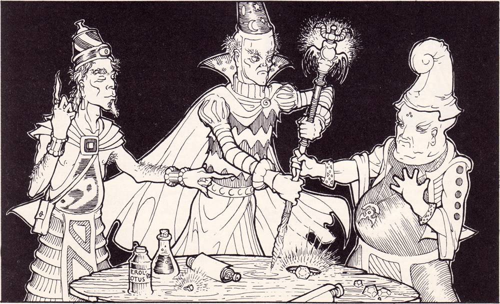
I loathe and despise them.
he misread it as BASTHow is that BAD???
I can't share one picture, but most of the 2E black cover books fit this--most not all. I can't stand to go from Elmore to that hideousness.
LOL. I was hoping someone would get my joke. It’s the same post I made in favorite pics.How is that BAD???
Yeah, nobody wanted a reprint of that version. Such a waste.Oh yeah, that whole "2.5" Players Option line was so horrible for art, from the covers onwards. I remember whe WoTC was releasing the special brown cover collector reprints of all the old TSR editions a few years back I could not believe they decided to go with those instead of the original 2e core books. Blar
FWIW, I noticed, but then I was wondering whether you haven't mistaken the threads...and I only read your post now, anyway, after you've explained itLOL. I was hoping someone would get my joke. It’s the same post I made in favorite pics.
 .
. !)
!)They don't. They've got them wings...How else do you think they clean up their enormous poops?
 !
!
Good to keep a cannon around when you are hiding cannonballs in your blouse.
What's the story behind the 2e black cover editions?Oh yeah, that whole "2.5" Players Option line was so horrible for art, from the covers onwards. I remember whe WoTC was releasing the special brown cover collector reprints of all the old TSR editions a few years back I could not believe they decided to go with those instead of the original 2e core books. Blar
I like a lot of Jeff Easley's work, but this was not his finest hour:
View attachment 46814
"lolwhut? I has a cannon...hope I don't spill my coffee"

What's the story behind the 2e black cover editions?
I left rpg hobby mid way through the 2e run and was shocked to see what they did to that edition not only in terms of inside art but red print (wtf).
Does anyone know the story behind this epic horrible decision?
Oddly, he doesn't seem to get as much love as other tsr contributors of his generation.I think of all the D&D artists, Keith Parkinson had the least amount of head-scratching compositions and just plain bad art.

Oddly, he doesn't seem to get as much love as other tsr contributors of his generation.
It might be because his biggest cover at TSR was probably Gamma World 3E but you could argue it was the Forgotten Realms boxed set. If he had gotten a D&D box it might have pushed him to the forefront more.Oddly, he doesn't seem to get as much love as other tsr contributors of his generation.
I think the FR box art was pretty iconic. At the time it really gave that setting a gritty grounded vibe... even if it went off rails pretty fast.It might be because his biggest cover at TSR was probably Gamma World 3E but you could argue it was the Forgotten Realms boxed set. If he had gotten a D&D box it might have pushed him to the forefront more.
Elmore nailed exactly the right dose of wholesome family style fantasy.... and cheesecake.If you asked me to pick a couple years of any artist ever at TSR, I would always say Elmore in 1982-83. Just great covers and interior art.
I like a lot of Jeff Easley's work, but this was not his finest hour:
View attachment 46814
"lolwhut? I has a cannon...hope I don't spill my coffee"
Still looks freaking awesome!
Though, I did always wondered about that pose and why tha hell she was holding a cannon, till I did a double take and realized that was supposed to be some sort of vase of something. I think the thing in her other hand is supposed to be an ornate cork.
The weird thing about that pic, was that it was in 2e, when the Dragons got powered up big time. In 2e, that poor thing's practically out of the egg. In 1e it's a lot older.Yeah, I mentioned in the other thread its piece always made me sad as a kid. And , it's ike, I an imagine mama Dragon like just dessicating the kingdom over this and rightly so.
What's wrong with it? No seriously, what? I like it. It's a lot better than some of the stuff I've seen here.I like a lot of Jeff Easley's work, but this was not his finest hour:
View attachment 46814
"lolwhut? I has a cannon...hope I don't spill my coffee"
What's wrong with it? No seriously, what? I like it. It's a lot better than some of the stuff I've seen here.
As opposed to Clyde Caldwell, who clearly leans toward the latter.Elmore nailed exactly the right dose of wholesome family style fantasy.... and cheesecake.
God bless him.

As opposed to Clyde Caldwell, who clearly leans toward the latter.
Still looks freaking awesome!
Though, I did always wondered about that pose and why tha hell she was holding a cannon, till I did a double take and realized that was supposed to be some sort of vase of something. I think the thing in her other hand is supposed to be an ornate cork.

Though I'll def take that over weird fetishized Dragonborn and Tabaxi any day