Poor choices in fonts & layouts and you

Best Selling RPGs - Available Now @ DriveThruRPG.com

Ralph Dula

Fighter of Fungi, Mortal Foe of 5E, Possibly a Cat
Joined
Nov 28, 2020
Messages
1,823
Reaction score
5,327
I’ve discovered that a game whose first edition is OOP and whose second edition has been unsupported for some time has nearly the entire line up for purchase as PDFs. With the holiday sales going on, I decided to take a look at the previews for the books for the first time.


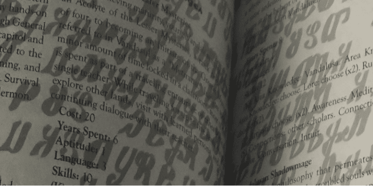
It wasn’t until now that I learned the publisher pulled a White Wolf, with swaths of in-game text printed in odd fonts on dark backgrounds. As it is my attempts to read the previews with such text has left me able to read only a few words, along with a case of eye strain.


I’ve been informed not all the books have copious amounts of text in odd fonts, and I find myself debating buying the PDFs, then copying the odd fonts and pasting them into a Word document that made them more legible. But it got me to thinking. The Secret of Zir’An was legendary for being illegible to many, even those with good vision. From posts elsewhere I believe I’m not the only one who dropped Dark Heresy when it went to its second edition, due to issues reading the text due to the background page color.


I’m curious; If you are interested in a game but the design choices make it literally hard to read, do you stick with it, or move onto another game and forget about it?
 
Bad design is bad design. You can do fancy fonts and whatnot quote well without makong anythjng illegible. Look at Mork Borg.
 
Bad design is bad design. You can do fancy fonts and whatnot quote well without makong anythjng illegible. Look at Mork Borg.

i guess part of my concern is “Am I missing out on good writing because of poor editorial design choices?” One of the books in the series is a labor of love on the author’s part by all accounts, and I wonder if missing out on his effort because of editorial decision is a wise choice.

I had an experience decades ago where an editor decided to change two portions of a manuscript of mine, and everyone who read it has said “I liked what you wrote, but...” then proceeded to tell me the things the editor changed were crap, so I know what it’s like to have your work judged on things you’ve no control over.
 
You might be, yeah. I have trouble forcing myself to read books that give me eyestrain, regardless of how good they might be. It just isn't any fun.
 
I hear you. There are some books out there that I avoided, despite their quality and popularity, purely because the layout and art gave me literal eye strain and headaches.

If game designers can't hire a proper layout person (ie, Desktop Publisher or whatever), then they should at least watch a free YouTube course on the subject.
 
So I used to work as a typesetter once. No, Really.

It's all a bit dimly remembered, but typography is not rocket science these days, especially for something like a rulebook. Composition systems like Indesign do most of the work for you. If you're prepared to learn it, TeX does nearly all the work for you, and probably better than you can do it 99% of the time.

If you're like Fria Ligan and have a house artist on the books you can do something like Mork Borg. If you don't, then stick to a straightforward grid-based layout and don't try to get clever with the typography and colour choices. I guarantee that you won't screw it up nearly as badly as if you try to get clever without knowing what you're doing.

Laying out a book just isn't that hard with modern software. You have to go out of your way to screw it up.
 
Stalker shows — IMHO — that a grid layout doesn't help if you cram in too much text. Using Comic Sans as the body font doesn't help either. By itself, it's not a particulary bad font, but it just doesn't fit in a serious science-fiction/horror game. As much as I want to like the game, I can't bring myself to read it; it's one or two pages of this typographical Yakety Sax and I'm like, sod it, and put it back on the shelf.
 
If game designers can't hire a proper layout person (ie, Desktop Publisher or whatever), then they should at least watch a free YouTube course on the subject.

This. Document design is kind of an odd side hobby for me. I'm no where near professional, but you can get "pretty good" without a lot of knowledge if you just put in a little bit of effort into understanding basics.
 
I’m curious; If you are interested in a game but the design choices make it literally hard to read, do you stick with it, or move onto another game and forget about it?

I've encountered lots of design choices that I thought were terrible, usually the result of the publisher trying to be artistic with text. But mostly those were games I was just browsing casually, so it was no big deal. They just made me shake my head and wonder "Why?"

I can think of two cases where I was seriously conflicted. Castles & Crusades had an edition that used tiny type, with brown ink on a page of lighter mottled brown. Reading it was unpleasant and gave me eye strain. I was angry because what I managed to read suggested that this was a game I'd love. Later I heard that a newer edition had fixed the issue. I found a copy at a convention and was able to check it out. The text was slightly bigger, but still unpleasant to read. I gave up on that game.

The second case went the opposite way. Esoteric Enterprises uses a text layout with no paragraph indentations or spaces separating paragraphs. At first I was appalled. It looks like the proverbial "wall of text". I went to the authors blog and discovered that she writes that way there as well. Her game design and writing were just so brilliant, though, that I forced myself to keep reading the 250-page rule book. Eventually, I became somewhat accustomed to that layout. By the time I was done, it was only mildly annoying and I'm really glad I persisted. It's such a great game.
 
As someone who does layout and design (among a number of other communications-related responsibilities) professionally, I find my tolerance for bad design is pretty low. I mean, my tolerance for everything is pretty low, to be honest, but that stuff really bugs me.

I find that way too many people think that layout is “easy” and that it doesn’t take any actual skill - I’ve had people tell me this to my face after they’ve laid out an ad with literally everything centered in a title font - so I expect bad design is often a matter of people just assuming they can do it after they’ve looked at a couple of professionally published rule books.

So, yeah, I have decided not to buy certain books after looking inside and finding really bad design. It doesn’t bother me that I might be missing out, though. I’ve never really suffered from FOMO much and I already have more good games than I will ever have time to run, anyway.
 
For a book that one actually expects people to read, I would by and large suggest shying away from trying to make the design 'arty' at all. There's a reason that books look like they do, and it hasn't been anything to do with limitations of the technology since Quark Xpress came out in the 1980s. I'm not even convinced that one really needs a highly decorative layout in order to impart atmosphere - novels do this all the time with a straight single-column galley in an ordinary serif typeface. For all that folks rave about Mork Borg, the samples I've seen come across like a '90s death metal 'zine. Does it help? Perhaps. Did it get attention? Sure did. Was it necessary to understand and play the game? Not at all.

RPG books also need to be usable, so attention needs to be paid to function as well as form. I can see the temptation to try and be clever, but my suggestion is to resist that temptation unless you know exactly what you want to achieve and why.

These days I do a lot of technical and semi-technical documents, mainly specifications and governance collateral like PIDs or scope/approach proposals. If you're going to expect folks to read and make sense of a 200-odd page spec document, it had better have had some attention paid to readability.

Fortunately I've not had a lot of occasion to have to unpick badly laid out rulebooks in anger - with the possible exception of the 5e players handbook but I won't go into that.
 
Last edited:
I don't know what you guys are talking about.

The only color of page is white, the only color of text is black, the only fonts are Times New Roman and Ariel, and the only colour of dress shirt is white.
 
I try to stick my lane of a straightforward b/w layout.

My worst experiment to date is trying colored headers for my stat block. My initial friend test failed so I never used it for a published product.

1606696579016.png

Although I did switch over a dark grey for the subheaders on my stat block as result of feedback.

1606696380572.png

My most recent challenge is what to do when there not enough text in the monster description to fill the space next to art. I opted to have the text end short of the stat block aligned with the bottom of the image.

1606696451013.png
 
One of the worst design decisions I have ever seen in an RPG book was The Secret of Zir'An, which printed the rules in standard black text in two columns but put a silver background of fantasy typography on all the pages. I'm sure it looked awesome in InDesign or whatever they used in the early 90s, but looked TERRIBLE in the actual book. It rendered the game unreadable!

The images below don't show off the SILVER-ness of the background. It really messed with your eyes!

ziran-bad-print-1-768x384.png


ziran-bad-skills-1-768x384.png


Which is a shame because the setting is interesting, the art is amazing, the production design within the setting is amazing, and I really want to play in that world. But the actual book was just impenetrable and unusable. A new edition without the silver background text would be so welcome!
 
What's meant by a grid-based layout? And what are the other options?
Grids are a technique where you set up a regular grid and fit the layout to multiples of that grid. It makes things look in proportion. At its simplest, it could be just a two column set of guides like you would see on word processing software. They can get a bit more complex than that - for example, you can use them for composing illustrations and making sure certain parts of the illustrations or page layouts sit in proportion to each other.

Here are a couple of articles on using grids.

 
One of the worst design decisions I have ever seen in an RPG book was The Secret of Zir'An, which printed the rules in standard black text in two columns but put a silver background of fantasy typography on all the pages. I'm sure it looked awesome in InDesign or whatever they used in the early 90s, but looked TERRIBLE in the actual book. It rendered the game unreadable!

The images below don't show off the SILVER-ness of the background. It really messed with your eyes!

ziran-bad-print-1-768x384.png


ziran-bad-skills-1-768x384.png


Which is a shame because the setting is interesting, the art is amazing, the production design within the setting is amazing, and I really want to play in that world. But the actual book was just impenetrable and unusable. A new edition without the silver background text would be so welcome!
That type of overlaid layout was pretty typical in early 1990s books, including some White Wolf ones, like Book of Shadows for Mage: The Ascension 1st edition. Aria: Chronicles of the Monomyth had pages that were undecipherable. The two Kult Conjurer’s Guide supplements that detailed occult sciences - Heart, Mind and Soul and Beyond the Boundaries has some really evocative glossy imagery throughout, but overlaid the text against it with a tiny font that was very hard to read. The content was pretty awesome though, so you strained your eyes a lot.

It can work the other way round too. The layout of Champions Complete is so plain it is practically soporific, and barely conveys any sense of comic strip action.
 
Banner: The best cosmic horror & Cthulhu Mythos @ DriveThruRPG.com
Back
Top