Neon
Legendary Pubber
- Joined
- Oct 24, 2020
- Messages
- 420
- Reaction score
- 1,213
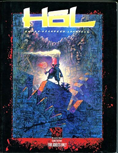
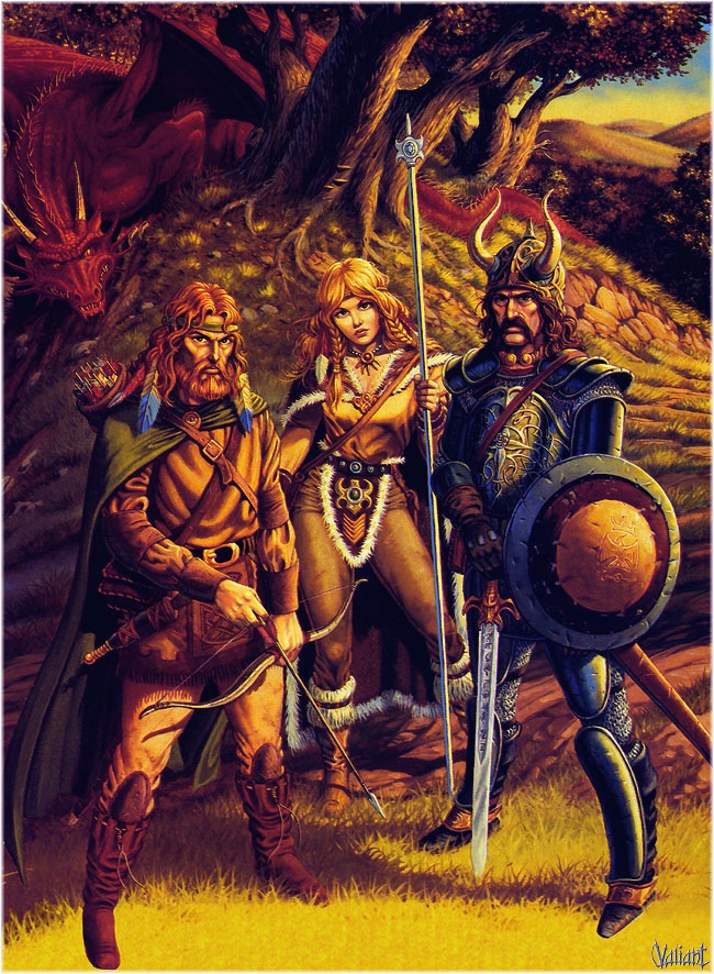
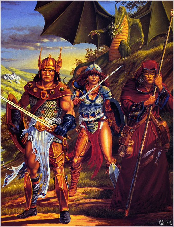
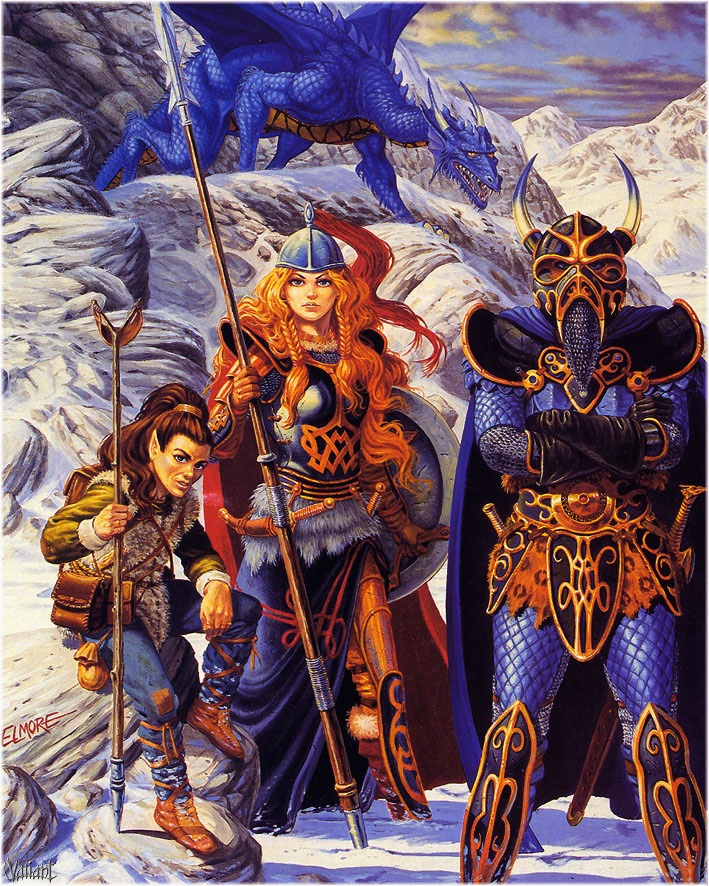
LotFP used to have some pretty epic art that stayed in the same vein. Their newer artwork is... different. Very cartoony, stylized, and kinda... amateurish.
Speaking of the good old days, now that Raggi says he will stop catering to his critics will he be reprinting the Lego Maniac's titles?
Speaking of the good old days, now that Raggi says he will stop catering to his critics will he be reprinting the Lego Maniac's titles?

 ).
).